

Using the Wardley Map For Product Market Fit Analysis
Part 1

In researching the patterns on sketchnoting, I came across an interesting pattern that I had never used before - the Wardley Map pattern. Used to define corporate strategy, it can also be used by Product Managers to determine how to prioritize product capabilities in their roadmaps, as well as to strategically partner with supporting technologies, either embedding them (vs. building them) or outsourcing their realization to a third party or professional services.
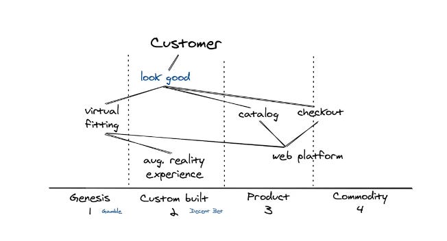
Wardley Maps start with the customer at the very top of the map, and what the customer’s needs are (which define the market for your product) are the first nodes from the top, and there can be more than one need. These needs are the main drivers for purchasing the product. The next nodes below it are the capabilities of your product (or products) that satisfy the need, and then all of the nodes below are the dependencies of those capabilities, usually directly mapped to the products or sprints Product Management is working on. Each of those is then dragged to the left or right, sorted by future capability (roadmap), the need to custom build it (IP), the current existence (current capability), or possibly commodity - not built by the company, but outsourced, embedded, or otherwise delivered by “commodities” - things not made by the company itself.
I’ve never used this pattern before because I’ve never been called upon to create Product Strategy out of thin air, but I have seen these used in product meetings. In the role of a Manager or Strategist of Presales Engineers, what I have been called on to do is prioritize features on the roadmap based on blocked opportunities in my territory, as well as bring customer feedback back to PM. Typically that’s involved surveying the field, logging opportunities to features in JIRA, etc, to generate a data driven ranking for prioritization. However, I’ve never presented data or feedback from the field visually for Voice of the Customer, and I don’t often see a visual representation of capabilities presented alongside this data, used in explaining direction. I think the ability to first produce this map for your particular product, then creating additional competitive product maps, or weighing the nodes based on particular customers might result in some easy ways to not only clarify your product’s unique value, but also help everyone in the field understand that value, and the competitive perspectives. It might also help them understand the customer’s needs better if they’re new to the industry.
So for the next few issues of this newsletter, I’m going to explore using this pattern to map your customer’s needs, and possibly map it to competitive products, and use it to visually communicate these ideas, aligning Product Management, Marketing, Sales and Presales on your product and vision. Go ahead and read up a bit on this pattern, and we’ll explore that in Part 2!